Those who know me, even only a little, are probably aware that I'm a bit obsessed with eyewear. A full-time glasses wearer since ditching irritating contacts several years back, I began my love affair with the whole affordable glasses concept when Warby Parker first launched in the U.S. in 2010. Now that I'm EU-based, Ace & Tate is my go-to for owning multiple frames to mix up my look depending on my mood - and letting me see things clearly for a relatively low price. I'm a big, big fan.
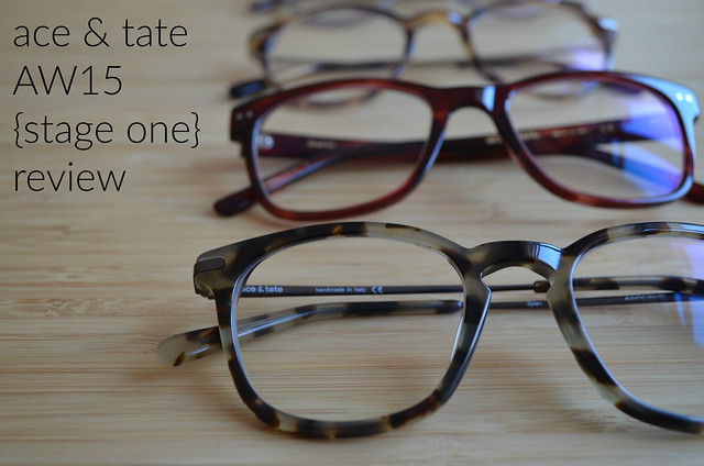
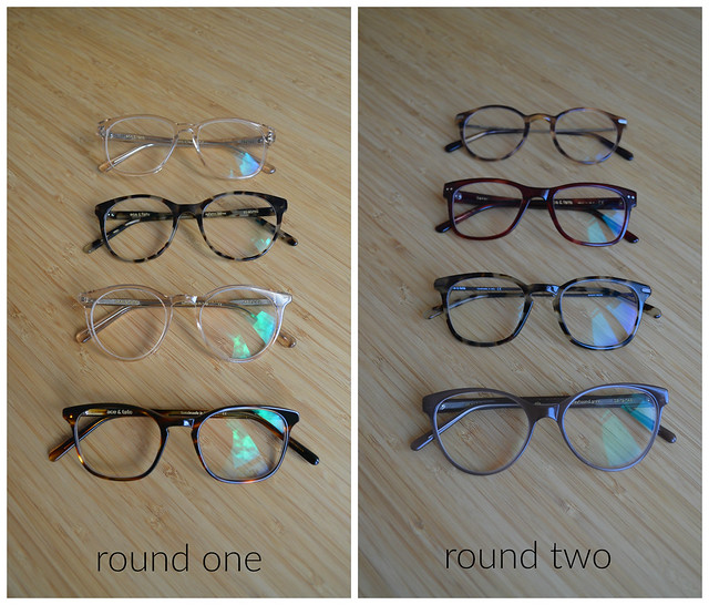
In an effort to put all my eyewear obsessing to good use, I figured I'd help my fellow four-eyes by doing a round-up of Ace & Tate's first collection of Autumn/Winter 2015 frames (for more, see my first home try-on last year here). I have found it invaluable to see how frames look on more than just the one website model, not to mention getting a better feel for sizes and colors. If I hadn't seen my beautiful Lucca frames in the pop-up shop here in Berlin, I never would have ordered them. What appeared to be a rather garish peachy-pink online somehow became the most gorgeous nude against my skin tone. So if you can't get your hands on this collection in a shop or perhaps are unsure of where to start with a home try-on, I'm here to help:
 |

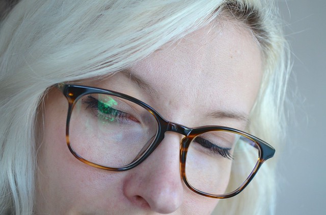
Wilson in Tiger Wood
This rather classic frame shape and colorway appealed to me immediately online, and in person, I could see why. It's soft-edged, squarish shape is very flattering and the warm brown is both versatile and rich. The slightly more delicate frames and arms give a more masculine style a softer, more feminine touch, which is spot-on for my style. It reminded me a little of when I first tried the George on, but with an amped up elegance.


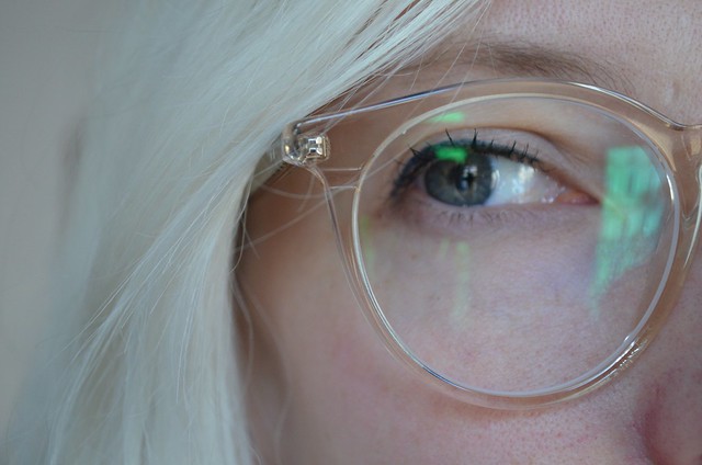
Easton in Champagne
I had high hopes for this frame because it was reminiscent of my Luccas: round with a light color. But light frames, I've found, can be the toughest of all. While this Champagne hue is enticing both in name and neutrality, it's a difficult match for someone of my fair-skin, fair-haired persuasion. The frame shape and size was great, not overly large and round as I was expecting (keeping in mind that I already wear what many people would consider oversized frames), I just wished it came in some of the new brown-based tortoises, like Autumn Leaves. I've seen frames this color look great on folks with darker hair and slightly cooler skin tones, and I'd highly recommend this frame to them. Sadly for me, it was a pass.


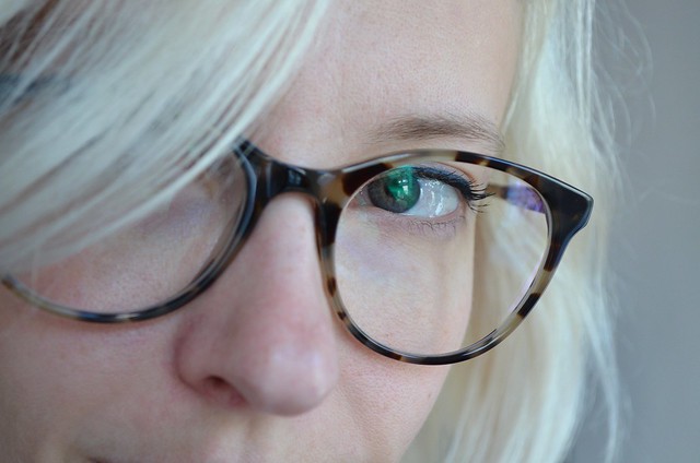
Lily in Autumn Leaves
This was the immediate winner of my first batch of try-ons this season. Feminine without being overly so, these roundish frames are large enough to make a statement but light enough to not feel overpowering. Very Euro eyewear chic. And this Autumn Leaves colorway - I'm in love! It's the perfect lighter, neutral tortoise that is neither too yellow nor too red (two of my biggest beefs with the most classic of glasses colors). The Lily is a definite contender for my next pair of frames.


George in Champagne
Unsurprisingly after the Eastons, the George in the same color was rather disappointing. Again, the Champagne would be great on the right person, but something about it in this shape felt a little lacking. I remembered liking this frame when I tried it on in my first home try-on, but in this combination, I was put off of the frame as well. Perhaps I just prefer these stronger, more masculine shapes in more classic tones, but I was left wanting more from this pair.

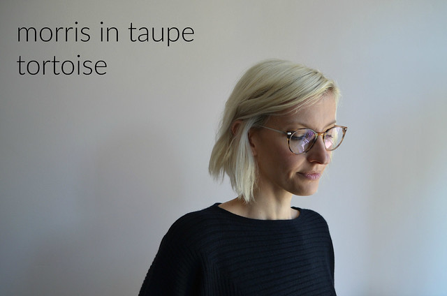
Morris in Taupe Tortoise
I admit, the introduction of metal elements was not at all appealing to me, but I figured if I was going to a proper review of the newest collection, it would be necessary to try these as well. I couldn't have been more surprised! The metal arms didn't read as 'nineties nerd', as I feared they might. Instead, they offered a fresh architectural element to balance out the plastic that's been the trend for so many years now. I will admit that in this round frame, the combination is a bit of a throwback frame to a much older era, but if you can pull it off, it's a great frame to do it with. The brushed metal is a soft, slightly cool-toned brass that plays the part of a great neutral. The small caveat I had was that the taupe that came across as a cool neutral on the website read much more yellow in the sunlight. Great for those with the right coloring, but perhaps a bit too off for me.
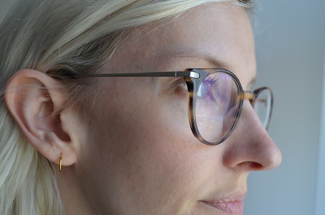



Ella in Greyhound Grey
A pretty classic, oversized cat-eye frame, Ella also surprised me a little. This shape has never been my favorite, its dramatic flair often overpowering for my more introverted tendencies. Though this particular frame in this muted hue felt soft and feminine, like something I could actually pull off. Even though they didn't feel 100% "me", I was very tempted by the Ella.



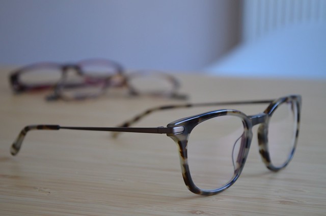
Dylan in Autumn Leaves
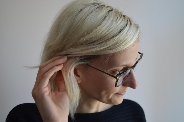
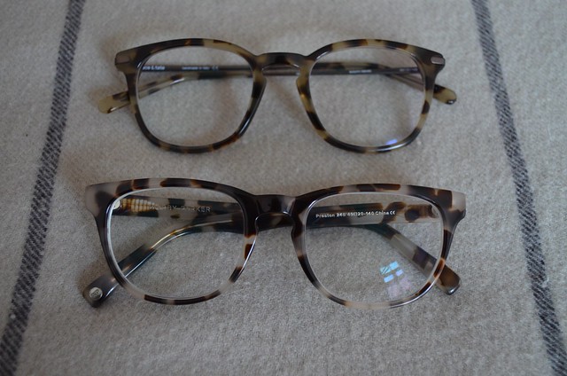
The second of the new line with 'Constructional Elements', the Dylan pairs the metal arms perfectly with the slightly thicker, squared plastic frame. This combination feels more current than on the Morris, and I can't help but still be completely smitten with the Autumn Leaves tortoise. Perhaps it's because it's so close to my all-time favorite Warby Parker frame: the Preston in now defunct Pearl Tortoise (pictured below). The metal is also a perfect not silver, yet not gold natural that won't make you choose sides with your jewelery collection. Best of all: those slim metal arms seem strong enough to hold up to my clumsiness without bending all out of shape. These were definitely my favorite out of the second round of try-ons.



Baker in Rich Mahogany
I tried this frame on at a pop-up shop and remembering liking its flattering shape, but passed on it because of its ubiquitous styling. This try-on has made me rethink this logic. That classic shape is a classic for a reason! Here again, I was surprised by how much I liked this color. For a child of the eighties, red frames can have off-putting associations with Sally Jessy Raphael. These that looked so red online, had a more brown, slightly muddled, tortoise-like appearance that was a far cry from the bright cherry reds I remember from yesteryear. While these didn't have the 'wow' factor some of the others had for me, these are frames I would love to have tucked away for a rainy day.

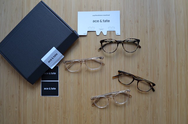
It's also worth noting that Ace & Tate home try-ons now come with a tool to measure your pupillary distance (the distance between the centers of the pupils of each of your eyes) yourself. While you still need to enlist the help of a friend for accurate measurements, it's great to obtain this on your own, as opposed to depending on a eye examiner that may not want to release this information to go order frames with someone else (I've heard this has become as issue in the U.S. with all the online retailers). The packaging and process also continues to be streamlined and simple, making it that much easier to pick out your next set of frames. Ace & Tate's pledge “with every pair of glasses you purchase from us, you help provide someone in need with access to eyecare” continues, so you really have no reason not to order with them.
How about you: Do you wear glasses? Which of Ace & Tate's new frames do you like?
This review is my honest and unbiased opinion. I have not been compensated in any way by Ace & Tate, I just love its products.


